In today’s data-driven world, organizations are constantly seeking ways to extract valuable insights from their vast amounts of data. One of the most effective methods to achieve this is through data visualization. By presenting complex data in a visually appealing and easy-to-understand format, data visualization enhances the user experience (UI/UX) of analytics platforms, enabling users to gain valuable insights quickly and efficiently.
What is Data Visualization?
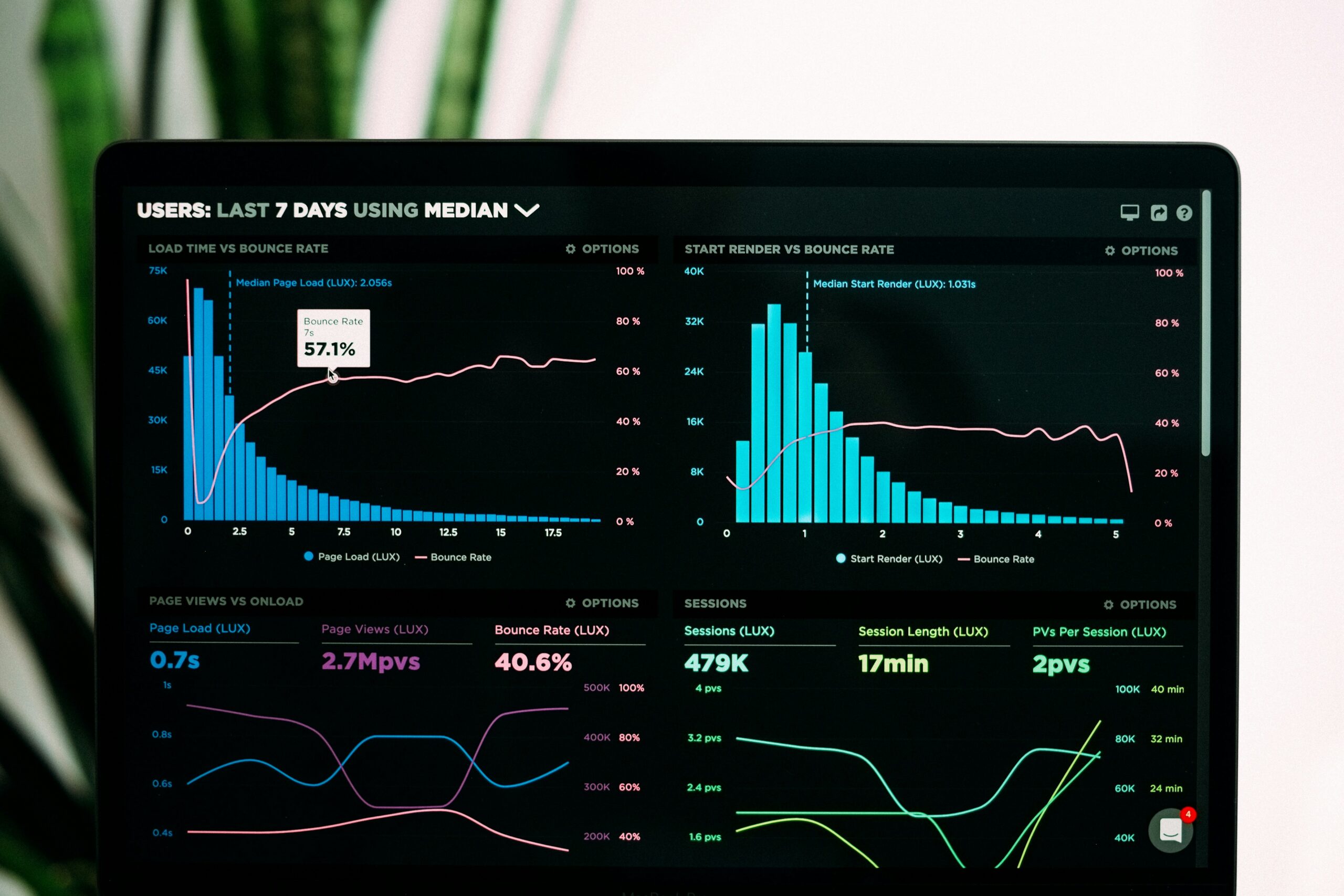
Data visualization is the graphical representation of data and information. It transforms raw data into visual formats such as charts, graphs, and maps, making it easier to understand patterns, trends, and relationships within the data. By presenting data visually, complex information becomes more accessible, enabling users to make informed decisions and gain insights that may not be apparent in raw data.
The Importance of Data Visualization in Analytics Platforms
Data visualization plays a crucial role in analytics platforms by enhancing the UI/UX. Here are some key reasons why it is important:
1. Simplifies Complex Data
Data visualization simplifies complex data by presenting it in a visually appealing manner. Instead of going through rows and columns of numbers, users can quickly grasp the meaning behind the data through visual representations. This simplification enables users to identify patterns, outliers, and trends more efficiently, leading to better decision-making.
2. Facilitates Data Exploration
Effective data visualization allows users to explore data interactively. By providing interactive elements such as filters, zoom, and drill-down capabilities, users can dig deeper into the data and uncover hidden insights. This level of interactivity enhances the user experience, making analytics platforms more engaging and empowering users to discover valuable information on their own.
3. Enables Real-Time Monitoring
Data visualization enables real-time monitoring of key metrics and performance indicators. By visualizing data in real-time, users can track changes, identify anomalies, and take immediate action when necessary. Real-time monitoring enhances decision-making capabilities and empowers businesses to respond swiftly to emerging trends or issues.
4. Enhances Collaboration and Communication
Data visualization promotes collaboration and communication within organizations. Visual representations of data are easier to understand and share, enabling teams to communicate insights effectively. By presenting data visually, stakeholders can align their understanding and make data-driven decisions collectively.
Best Practices for Data Visualization in Analytics Platforms
To maximize the impact of data visualization in analytics platforms, it is essential to follow best practices. Here are some key guidelines:
1. Choose the Right Visualization Type
Not all data can be effectively represented using the same visualization type. It is crucial to choose the appropriate visualization type based on the nature of the data and the insights you want to convey. Whether it’s a bar chart, line graph, scatter plot, or heat map, selecting the right visualization type enhances clarity and understanding.
2. Use Colors Wisely
Colors play a vital role in data visualization. They can be used to highlight important information, differentiate data categories, or indicate trends. However, it is important to use colors wisely to avoid confusion or misinterpretation. Stick to a consistent color palette and ensure that the chosen colors are accessible to all users, including those with color blindness.
3. Keep it Simple and Intuitive
Simplicity and intuitiveness are key principles of effective data visualization. Avoid cluttering the visualizations with unnecessary elements or overwhelming users with too much information. Keep the design clean and intuitive, ensuring that users can easily understand and interpret the visual representations without any confusion.
4. Provide Context and Annotations
Data visualizations should provide context and relevant annotations to aid interpretation. Include clear labels, titles, and captions to provide context and help users understand the meaning behind the visual representations. Contextual information ensures that users can derive accurate insights from the data.
5. Ensure Responsiveness and Compatibility
With the increasing use of mobile devices and various screen sizes, it is crucial to ensure that data visualizations are responsive and compatible across different platforms. The UI/UX should adapt seamlessly to different screen sizes, ensuring that users can access and interact with the visualizations on any device.
Conclusion
Data visualization is a powerful tool for enhancing the UI/UX of analytics platforms. By simplifying complex data, facilitating data exploration, enabling real-time monitoring, and enhancing collaboration and communication, data visualization empowers users to gain valuable insights quickly and efficiently. By following best practices such as choosing the right visualization type, using colors wisely, keeping it simple and intuitive, providing context and annotations, and ensuring responsiveness and compatibility, organizations can create insightful analytics platforms that deliver a seamless and engaging user experience.
Leave a Reply