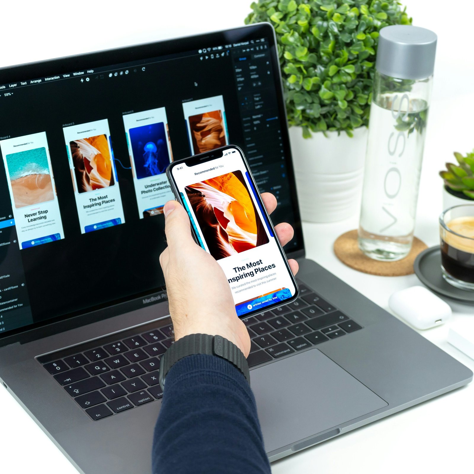
In today’s digital age, user interface design plays a crucial role in the success of any online platform. One company that has mastered the art of creating a visually appealing and user-friendly interface is Airbnb. With its seamless design and intuitive features, Airbnb has become a go-to platform for travelers around the world. In this blog post, we will explore the science behind Airbnb’s user interface and how it enhances the user experience.
Visual Hierarchy and Consistency
One of the key factors that contribute to Airbnb’s user interface success is its effective use of visual hierarchy. The designers at Airbnb understand the importance of guiding users’ attention to the most important elements on the screen. By using size, color, and placement, they create a clear visual hierarchy that helps users navigate the platform effortlessly.
In addition to visual hierarchy, Airbnb also maintains consistency throughout its interface. Consistent use of colors, fonts, and icons ensures that users can easily recognize and understand different elements across the platform. This consistency not only enhances the overall aesthetics but also improves the user’s ability to interact with the interface.
Intuitive Navigation and Search
Airbnb’s user interface is designed to make navigation and search as intuitive as possible. The search bar, prominently placed at the top of the page, allows users to quickly find their desired destination. The auto-suggest feature helps users by providing suggestions as they type, making the search process even more efficient.
Once users have entered their search criteria, Airbnb presents the results in a visually appealing and informative way. The use of high-quality images, concise descriptions, and clear pricing information allows users to make informed decisions without feeling overwhelmed.
Personalization and Recommendations
Airbnb takes personalization to the next level by offering tailored recommendations based on users’ preferences and browsing history. By analyzing user data, such as previous bookings and saved listings, Airbnb suggests relevant accommodations and experiences that align with the user’s interests.
This personalization not only saves users time but also enhances their overall experience on the platform. By presenting users with options that are likely to appeal to them, Airbnb increases the chances of users finding the perfect accommodation for their needs.
Seamless Booking Process
Another aspect of Airbnb’s user interface that deserves recognition is its seamless booking process. From selecting dates to reviewing the total cost, Airbnb guides users through each step with clear instructions and intuitive design.
The use of progress indicators ensures that users are aware of their current position in the booking process and what steps are remaining. This transparency helps users feel in control and reduces any potential confusion or frustration.
Mobile Optimization
Airbnb recognizes the importance of mobile optimization in today’s mobile-first world. The company has invested in creating a responsive user interface that adapts seamlessly to different screen sizes and devices.
Whether users are browsing on their smartphones, tablets, or desktop computers, they can expect a consistent and user-friendly experience. Airbnb’s mobile interface retains all the key features and functionalities of the desktop version, ensuring that users can access the platform anytime, anywhere.
Conclusion
Airbnb’s user interface is a testament to the power of effective design in enhancing the user experience. By prioritizing visual hierarchy, intuitive navigation, personalization, seamless booking, and mobile optimization, Airbnb has created a platform that users love to interact with.
As technology continues to evolve, it is crucial for companies to invest in user interface design that aligns with users’ needs and expectations. Airbnb’s success can serve as an inspiration for other businesses looking to create a visually appealing and user-friendly interface that delights their customers.


Leave a Reply