Introduction
When it comes to website design, one of the most important aspects to consider is navigation. A well-designed navigation system can greatly enhance the user experience and make it easier for visitors to find what they are looking for. In this article, we will explore the concept of intuitive UI/UX and how it can be applied to optimize navigation on websites. Using Tokyo as our inspiration, we will delve into the world of Tokyo Tales and discover the secrets behind their successful navigation design.
The Importance of Intuitive UI/UX
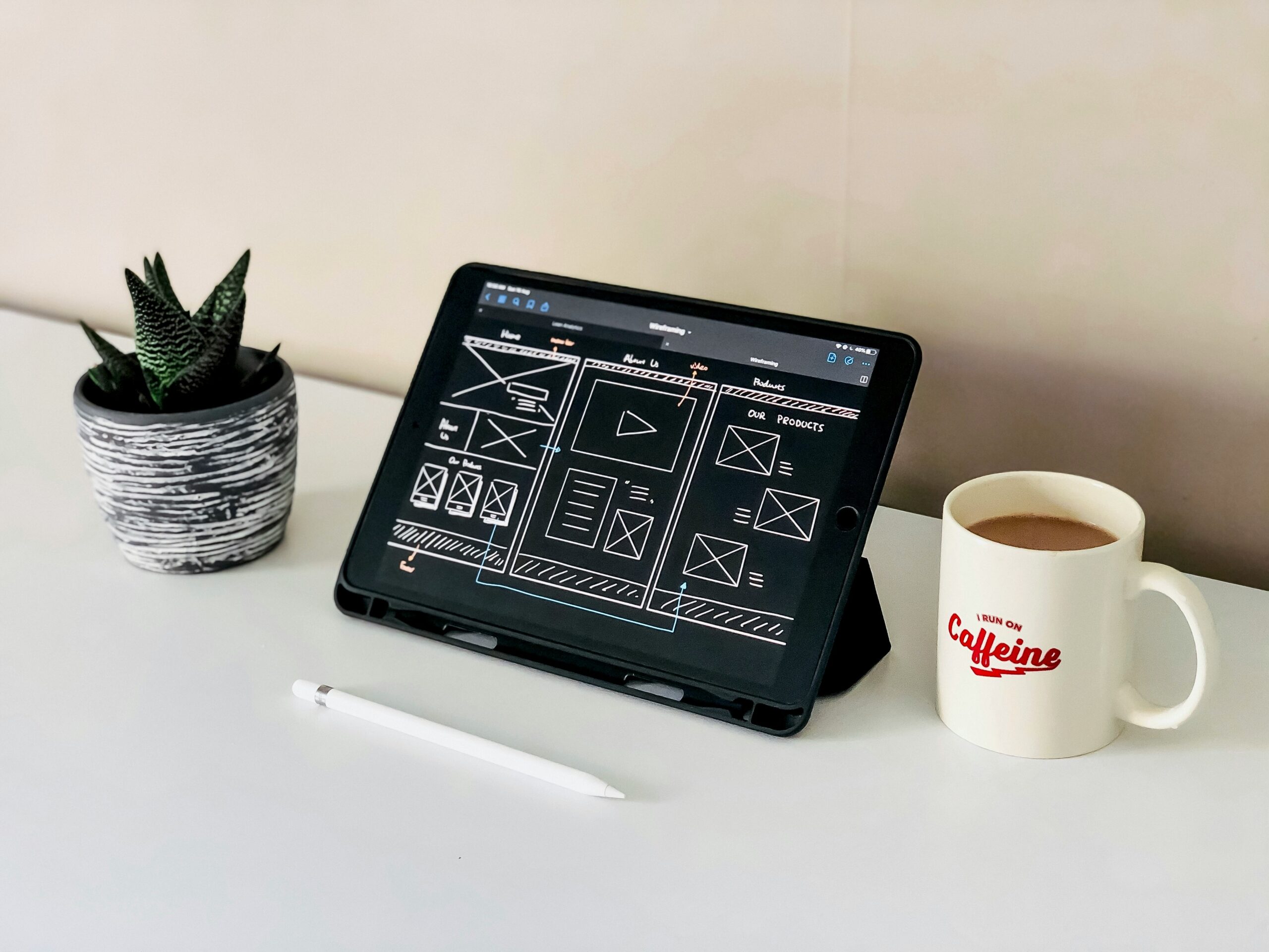
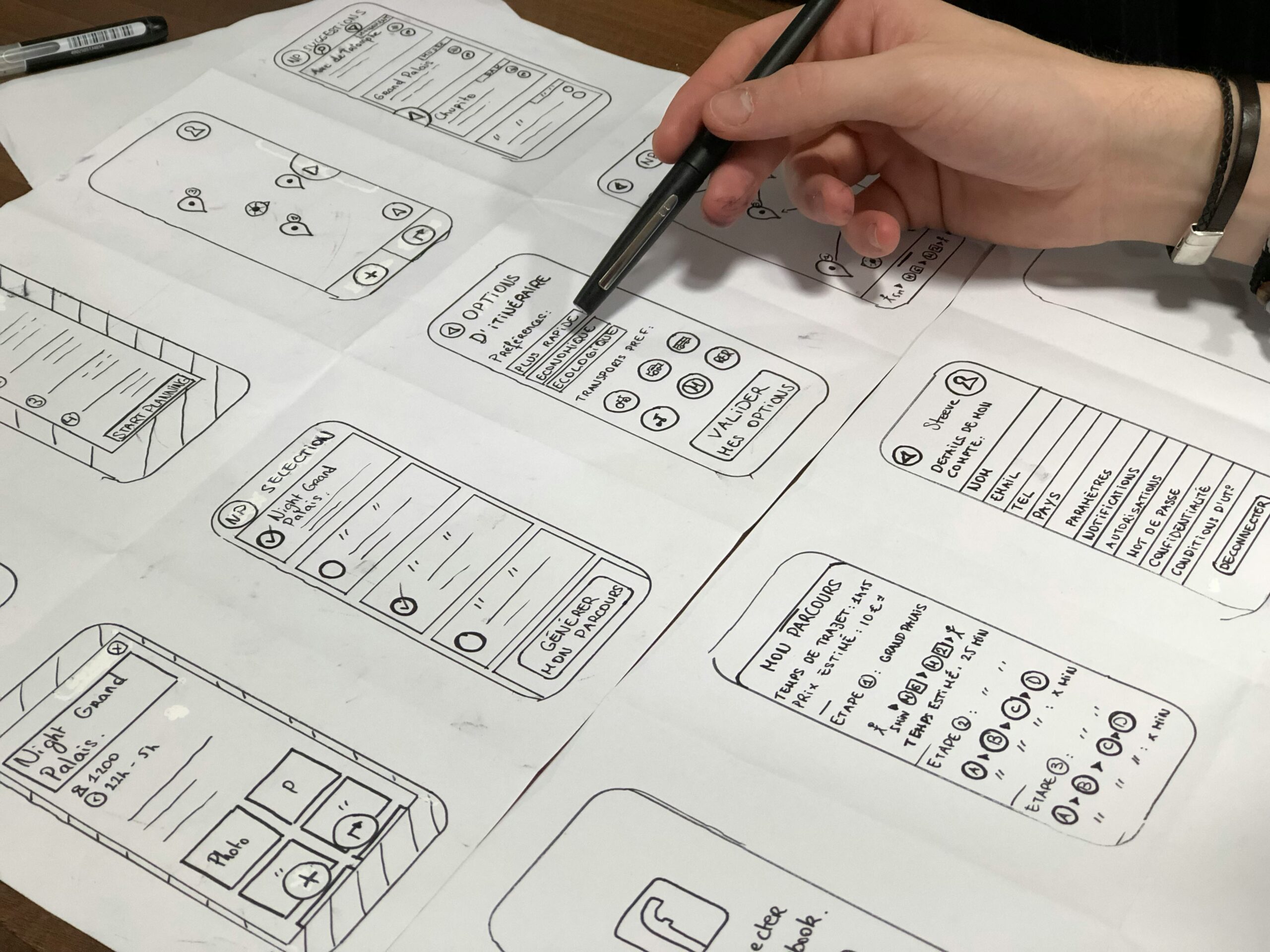
Intuitive UI/UX refers to the design of a website that is easy to understand and navigate without the need for explicit instructions. It focuses on creating a user interface that feels natural and intuitive, allowing visitors to effortlessly find the information they need. By optimizing navigation with intuitive UI/UX, Tokyo Tales has managed to create a seamless browsing experience for their users.
Clear and Consistent Navigation
Tokyo Tales understands the importance of clear and consistent navigation throughout their website. They have implemented a top navigation bar that remains fixed at the top of the screen, making it easily accessible from any page. The navigation bar is simple and concise, featuring only the most important categories. This ensures that visitors can quickly and easily find what they are looking for, without feeling overwhelmed by too many options.
Visual Cues and Feedback
Another key aspect of Tokyo Tales’ navigation design is the use of visual cues and feedback. When visitors hover over a navigation link, it subtly changes color or displays a small animation, providing visual feedback that the link is clickable. This small detail helps to guide users and gives them confidence in their actions. Additionally, Tokyo Tales uses breadcrumbs to show users their current location within the website, allowing them to easily navigate back to previous pages.
Responsive Design for Mobile Users
In today’s mobile-centric world, it is crucial for websites to be responsive and mobile-friendly. Tokyo Tales recognizes this and has optimized their navigation for mobile users. On smaller screens, the navigation bar collapses into a hamburger menu, taking up less space and allowing for a cleaner layout. This ensures that mobile users can easily access the navigation options without compromising on the overall user experience.
Search Functionality
For users who prefer to search for specific content, Tokyo Tales has implemented a search functionality that is prominently displayed in the navigation bar. This allows visitors to quickly find what they are looking for by simply typing in keywords. The search results are displayed in a clear and organized manner, making it easy for users to navigate through the relevant content.
Conclusion
Tokyo Tales serves as a great example of how intuitive UI/UX can greatly enhance navigation on websites. By focusing on clear and consistent navigation, providing visual cues and feedback, optimizing for mobile users, and implementing a search functionality, Tokyo Tales has created a seamless and user-friendly browsing experience. As website designers, we can learn from their approach and apply these principles to our own projects, ultimately improving the overall user experience for our visitors.


Leave a Reply